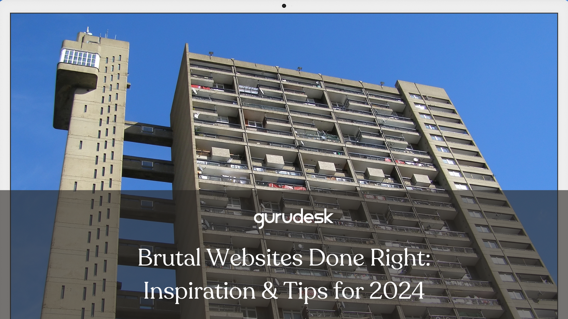
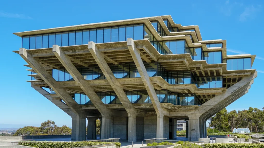
Brutal websites or brutalists, are a movement originating in mid-20th-century architecture that has made a surprising resurgence in the world of web design, known as brutal websites.
Brutalism can be a powerful tool for developing websites that are both visually striking and profoundly impactful due to its raw, exposed elements, bold use of concrete, and rejection of ornamentation.
However, successfully implementing brutalism in web design requires careful consideration to avoid a website that appears unfinished or user-unfriendly.
Key Elements of Brutal Web Design
Brutalism often uses a limited color scheme, favoring bold colors, monochrome palettes, and exposed web-safe colors for a raw and unprocessed aesthetic.
Common choices include blacks, whites, grays, and primary colors. These color palettes can evoke a sense of strength, seriousness, or urgency, depending on the specific colors used and their arrangement.
Minimalist Design with Purpose
Brutalist websites typically prioritize functionality over elaborate web design elements.
Clean layouts, clear typography, and a focus on essential content are hallmarks of the style. However, this minimalism should serve a purpose, not simply be an absence of design.
Carefully chosen negative space can create a sense of focus and guide the user’s eye toward important information.
Brutalism prioritizes the user experience (UX) by employing a clear visual hierarchy. Larger fonts, contrasting colors, and strategic use of white space ensure users can easily navigate the website and find the information they need.
Repetition of design elements, such as consistent use of a particular font or color throughout the website, can also reinforce hierarchy and create a sense of cohesion.
Brutalism embraces the underlying structure of a website. Exposed grids, raw images, and a focus on unstyled elements create a sense of authenticity and honesty. However, this rawness should be intentional and contribute to the overall design goals.
For instance, exposed grids can be used to create a sense of structure and organization, while raw images can add a touch of humanness and realism.
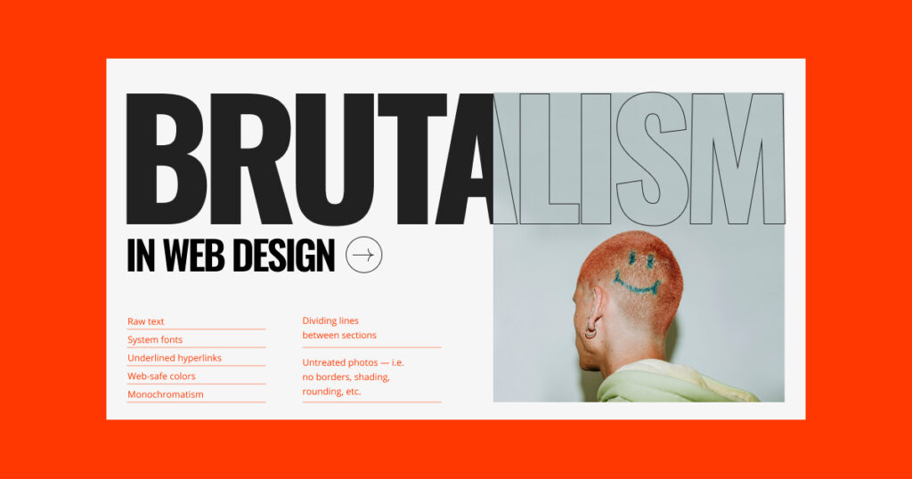
Large, Bold Typography for Readability
Brutal websites often use large, bold fonts to grab attention and enhance readability on various screen sizes. The specific font choices should complement the overall aesthetic of the website.
Sans-serif fonts are popular choices for their clean lines and legibility, but serif fonts can also be effective if they align with the website’s brand identity.
Brutalist Maximalism
While minimalism is a core tenet of brutalism, a recent trend embraces a more maximalist approach.
This involves incorporating brutalist design principles—bold colors, raw textures, and exposed elements—into a website that has a higher information density.
This approach can be effective for websites that require displaying a lot of data or content, creating a visually interesting and engaging experience.
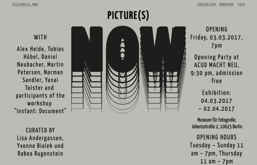
Inspiration and Tips for Brutal Websites in 2024
While brutalism encourages a raw aesthetic, ensure the website remains user-friendly. Prioritize clear navigation, intuitive interactions, and well-organized content.
A website’s content should be high-quality and well-written, especially since brutalism often minimizes visual distractions.
In 2024, a mobile-friendly website will be essential. Ensure your brutalist website translates effectively to a smaller screen for an optimized user experience.
Join the GuruDesk community and be among the first ones to discover the hottest trends in web services! We are a team of web experts and we love sharing our knowledge and experience with our readers! We share tips and tricks on a wide range of topics, including web development, cloud services, and hosting. Whether you are a seasoned pro or just starting out, we promise you will find valuable information here. So go ahead, hit that “Subscribe” button and let the fun begin!


