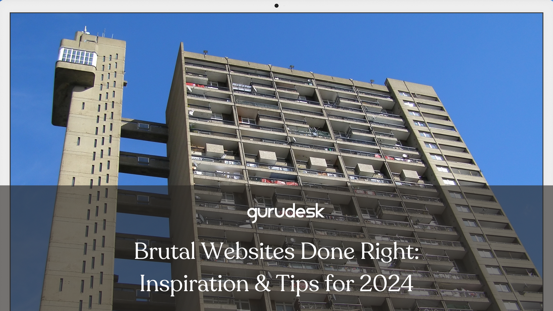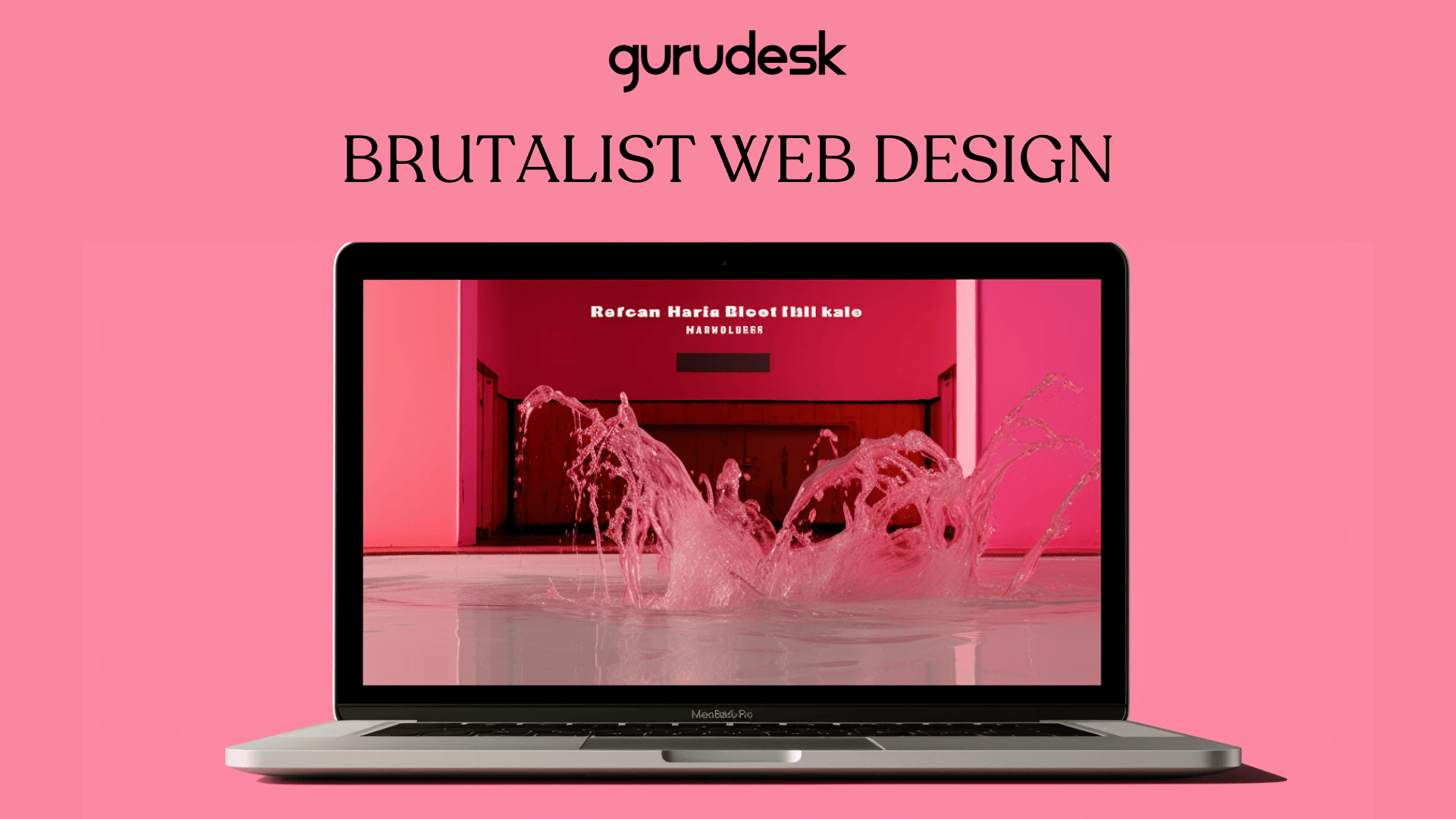
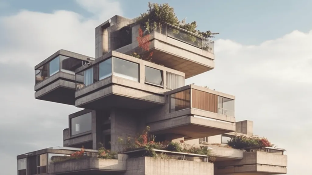
Brutalist Web Design – Brutalism, a style of design that initially originated in the field of architecture in the 1950’s, emerged. A French word that translates to ‘raw’, brutalist architecture was criticized for the use of not only raw materials, but also the exposition of concrete, as well as geometric forms.
In recent years, Brutalism found its way into web design with the use of bold typography, large blocks of text, and geometric patterns.
Why Brutalism Web Design?
The Brutalist design trend can be a great way to stand out from the crowd. The emergence of the digital world has currently held the appeal of user-friendly as well as minimalist and simplistic design trends.
Unique
You stand out from the crowd when using Brutalist web design. It’s already obvious that Brutalism is not everyone’s cup of tea; however, it can be a great way to showcase your website and have a unique and creative approach that separates you from the competition.
Express Brand Personality
Brutalist Design can be a great way to express your brand’s personality. If your online clothing website showcases the edge and boldness of those in a more gothic or punk scene, rest assured that brutalism web design can help make your business all the more rounded.
Community
With the raw and unfinished feel of Brutalism Web Design, this can make users feel as if they are a part of something special, something that is yet in the process of being developed and created.
Increase Usability
Contrary to popular belief, Brutalism in design can actually increase usability. By removing unnecessary elements and distractions, brutalist web design can be easier to scan and navigate. Think of it as a building stripped of the pain. All you have left is the concrete used. Similarly, a website using Brutalist design offers the important aspects, as raw as possible.
Load Time
Brutalism websites are oftentimes lightweight, which makes their loading time faster. This is especially important nowadays since users tend to abandon a website if it does not load within 3 seconds or less.
6 Key Features of Brutalist Web Design
With many design trends surfacing, it is important to note two things: many design trends share features with Brutalism. Two of the most popular design trends that are oftentimes mistaken for Brutalism are Minimalism and Anti Design.
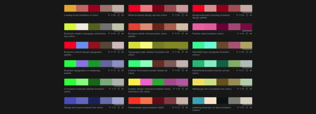
1. Color Palette
Brutalism’s design consists of clashing color palettes. Color theory has no place in Brutalism web design due to the need to create bold, shocking statements.
2. Minimal CSS
Brutalist websites often contain little CSS, which therefore offers a more grid-like layout and text-focused design. By working with an unstyled HMTL, defaults fonts, colors, geometrical shapes, you get a straight-forward, effective website.
3. Navigation and Hierarchy
UI/UX designers often study the best way to utilize information architecture principles in order to increase website navigation. When it comes to Brutalism, UI/UX designers are not needed to offer information hierarchy; therefore, use non-standard navigation.
4. Raw and Unconventional Design Elements
A Brutalist website intentionally creates an unpolished, raw environment that sticks to a bright clash of colors, or lack thereof.
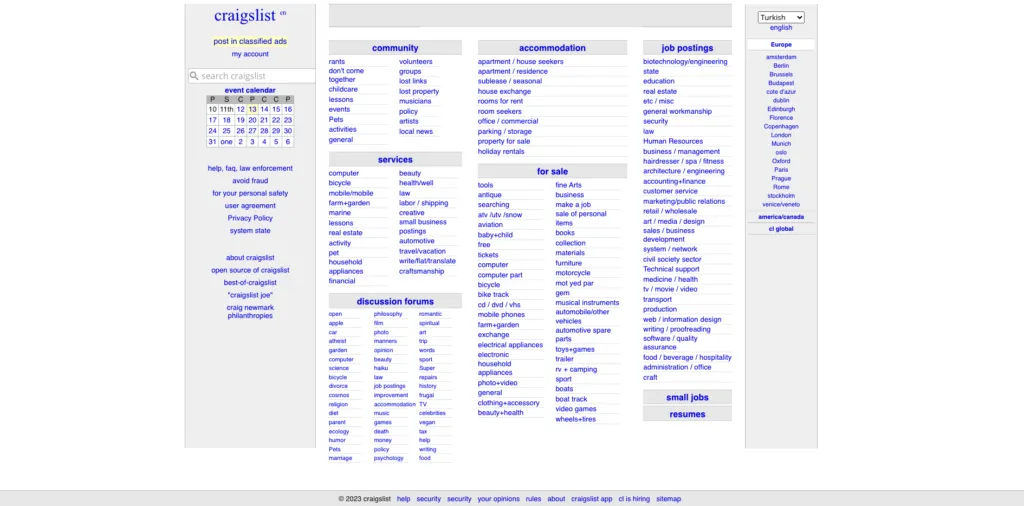
5. Repeating Patterns in Brutalism Web Design
Repeating shapes or patterns are frequently used in Brutalism. Whether it be in a modular or grid-based manner, Brutalism architecture is always showcased throughout the web design.
6. Honesty and Transparency
The use of edgy and raw designs in Brutalist architecture is not meant to distract, but rather to focus on functionality.
Brutalist Web Design for UI/UX
It is important to note that using Brutalist web design for UI/UX may not be for everyone. However, if the shoe fits, this is what you should expect:
Clarity
- By using large typography and clear, simple layouts
Emphasis
By emphasizing key elements such as:
- Logo
- Call-to-action
- Contact information
This can help improve the overall user experience by making it easier for users to find what they’re actually looking for.
Authenticity
Brutalist web design can help create a sense of authenticity as well as honesty for your website, which is a valuable asset for brands that want to connect with their customers.
4 Examples of Brutalist Web Design
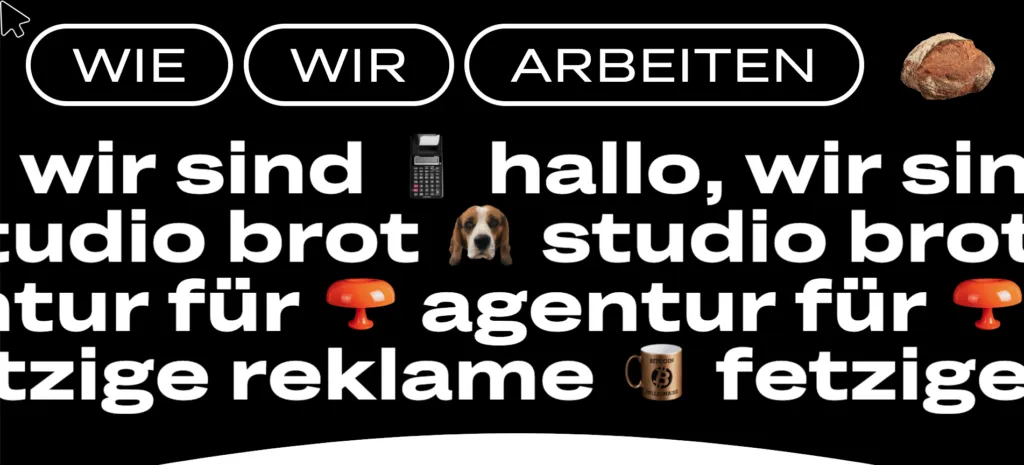
- Studio Brot:A German creative agency using Brutalism Design in order to create a sense of boldness and originality.
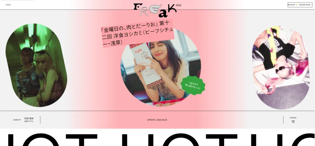
2. Freak Mag: A fashion magazine using Brutalist Web Design to create a sense of edgy and subversive style.
3. Hot Buro: A design studio using Brutalism Design creates a sense of clean lines and geometric forms.
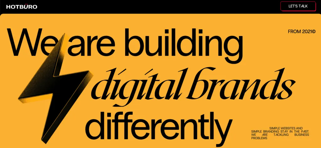
4. Ezekiel Auino: A web designer using Brutalist Design to create a sense of personal expression and individuality.
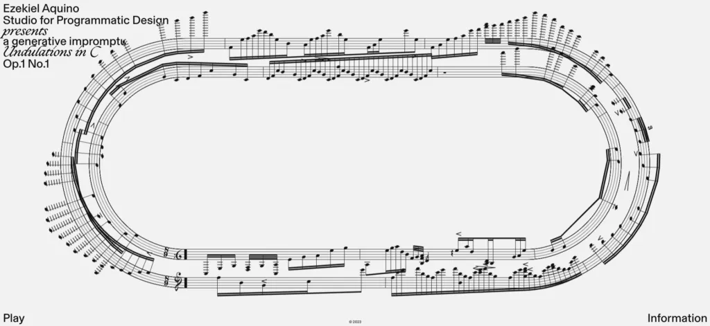
Brutalism Web Design
A bold choice for those looking for an unforgettable aesthetic, Brutalism can be a good option if you’re thinking of standing out from the sea of landing pages, hero images, and prepped calls-to-action. With a straightforward, transparent website, you are likely to increase customer relations.
TAGS:
Join the GuruDesk community and be among the first ones to discover the hottest trends in web services! We are a team of web experts and we love sharing our knowledge and experience with our readers! We share tips and tricks on a wide range of topics, including web development, cloud services, and hosting. Whether you are a seasoned pro or just starting out, we promise you will find valuable information here. So go ahead, hit that “Subscribe” button and let the fun begin!


