What is Website Navigation?
Website Navigation Practices: An essential aspect of a website is its navigation. Website navigation is the collection of user interface components that allow visitors to find content and features on a site.
The components can be in the form of copy, link text, buttons, and menus.
What is a Website Navigation Menu?
A menu in a website navigation is an organized list of web pages, which are usually internal site pages.
Navigation menus tend to appear in page headers or sidebars across the website, ensuring a smoother process for visitors to find the most useful pages quickly.
What are the Different Types of Website Navigation Practices?
A website navigation menu is crucial. However, did you know there are different types? For starters, when visitors land on your website, the navigation menu assists, leading to a higher bounce rate.
The way a website is designed to help your visitors navigate depends on your target audience. Some common types of website navigation are as follows:
Horizontal Navigation Bar – Website Navigation Practices
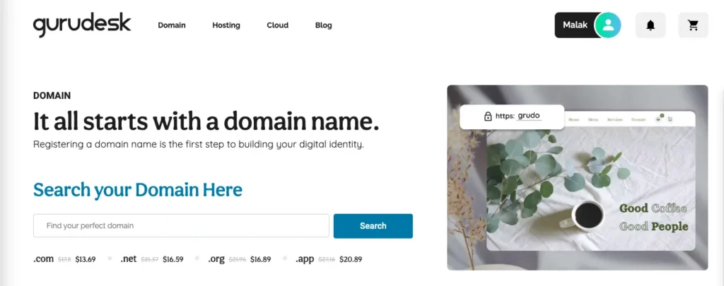
The horizontal navigation bar, known to be the most common, lists the major pages placed side-by-side. Many websites tend to stick to the same features, such as “About”, “Products”, “Pricing”, and “Contact”.
When building your navigation bar, consider what the website”s purpose and audience are. What are they hoping to achieve when on your site? What are visitors looking for?

Dropdown Navigation Menu – Website Navigation Practices
The drop-down navigation menu comes in second in rating. Ideal for content-rich sites with a complex IA, the drop-down navigation menu can’t list all the options side-by-side.
The most crucial or general items in the top-level navigation bar tend to be included, as opposed to everything.

Hamburger Navigation Menu – Website Navigation Practices
The hamburger navigation menu is popular with mobile web design, where the navigation items are listed horizontally on a larger screen.
When visitors click on the three-line icons, a vertical drop-down or horizontal pop-out tends to appear with the navigation list. If you choose to have a less compromising navigation menu, choosing a hamburger navigation menu is the right fit.
Vertical Sidebar Navigation Menu – Website Navigation Practices
An excellent choice for a seamless user experience. The items are showcased on top of each other and positioned in the sidebar.
The vertical sidebar navigation menu is considered to be the less popular navigation menu; however, it has its benefits, one of them being the top-level options.

Footer Navigation Menu – Website Navigation Practices
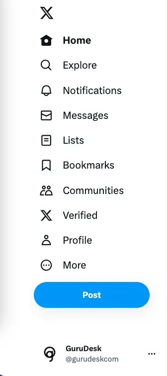
Typically paired with a horizontal navigation bar. Visitors don’t see the link until they scroll down to the bottom of the page and find a variety of options.
What is the Best Way to Phrase Navigation Options?
Choosing between the navigation menus depends on what your website or business runs. Make sure to choose whatever your brand’s intuitive design is.
Choosing the words to use in your main navigation links depends on the first thing you want your customers to remember.
Object-Based
Object-based places clear-cut options under concrete categories. This type of organization treats the navigation as a table of contents, simplifying it so your visitors are able to find what they need!
Action-Based
Do your customers tend to come to your site to learn about something or to take a specific action? Action-based uses more verbs, or action calls for audiences to create an action (as the name suggests).
Search Engine Optimization
When it comes to optimizing your website, it is very important to spend more time on the navigation. Using optimized words in the menu assists in bringing traffic to your website.
Using a variation of words helps guide visitors to your website, and you can do that by searching on Google to find out more about the highest queries or by visiting websites such as SEMRush or Ubersuggest which cut the work short for you!
Not only that, but it allows for a smoother user experience, keeping visitors and customers on your site for longer.
Website Navigation Best Practices
1. Consistency
A crucial website navigation practice is being consistent. Whether the format or the design, your navigation interface needs to maintain and align with the current knowledge and expectations of visitors.
2. Device Optimization
It’s important to ensure that your website and navigation are optimized for all devices, regardless of screen size. Think of a mobile-first approach when designing a website.
By initiating with the smallest screen size, you’ll be able to prioritize what links are most important to include within the primary navigation, as well as what order. This, therefore, assists you in knowing what to prioritize when moving to a larger screen.
3. Accessibility
The method behind this is that at least one website navigation structure should enable someone to land on any page on your website in three clicks!
Establishing clear pathways, reducing page load time, and removing other friction points in the user journey contribute to the overall metric system.
4. Breadcrumbs
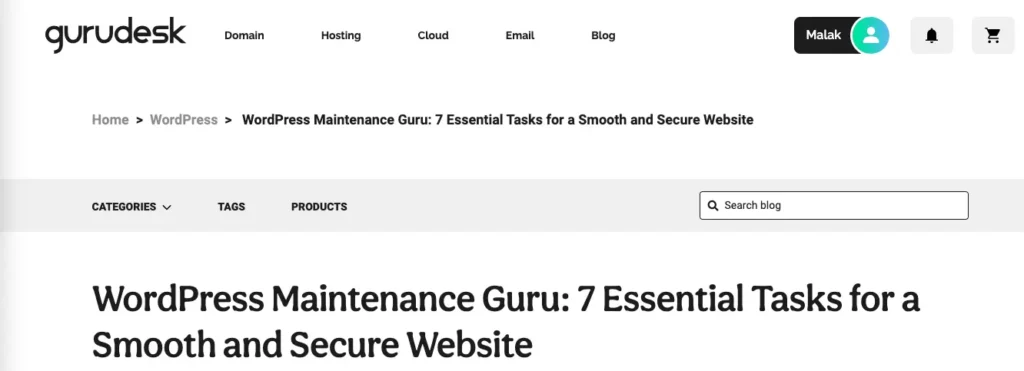
Visitors can visualize where they are in the website’s structure. Visitors are able to retrace their steps to other pages with a simple click. Typically, the secondary navigation bar is below the header and consists of text links separated by the symbol “>.”

Design Your Website With GuruDesk UI/UX Designers
Designing your website is an integral aspect of your brand identity. The ability to showcase what you have to offer lies in the first visit customers have upon arriving on your website.
Ensuring clear website navigation assists in all stages of the buyer journey. Not only that, but it offers customers a clear indication of what to click on since you prioritize their navigation.
On the opposite side of the screen, customers look for direction and ease.
Let our GuruDesigners assist you in building a website that offers first impressions that count and teaches search engine bots to index a positive user interface and user experience website worthy of being shared and ranked high.
Join the GuruDesk community and be among the first ones to discover the hottest trends in web services! We are a team of web experts and we love sharing our knowledge and experience with our readers! We share tips and tricks on a wide range of topics, including web development, cloud services, and hosting. Whether you are a seasoned pro or just starting out, we promise you will find valuable information here. So go ahead, hit that “Subscribe” button and let the fun begin!


