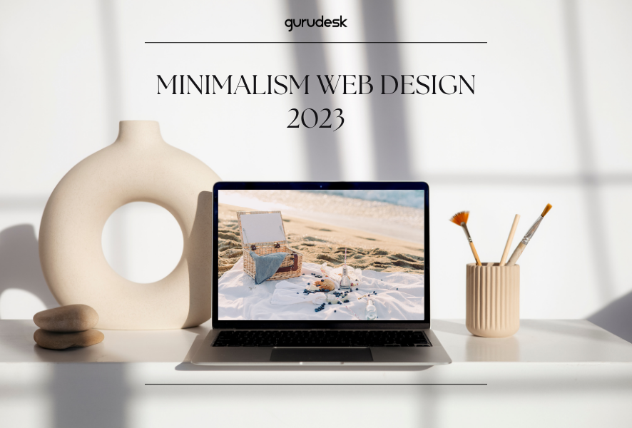
Minimalism Web Design – With the general goal for web design in 2023 being to generate engagement and create authentic brand experiences, Minimalism has taken a drift into new realms. A tilt toward dynamic movement, minimalism is incorporating the aspect of simplicity being key to showcasing business products and services.
We are offering you the different ways in which minimalism can help elevate your website design and bring out the spark in your products and services that much further!
Minimalism Design
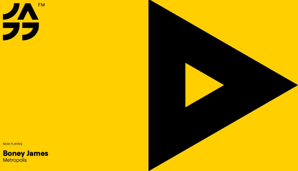
When you think of minimalist designs, oftentimes your mind focuses on a sense of modern professional designs that appeal to the senses. The minimalist approach is usually tackled by reducing unnecessary elements. How do you grasp your audience’s attention? Well, through a main image that is either centered, or a color scheme that is visually and mentally appealing. Most minimalist website designs harbor a large image centered, while others choose to use bold typography as the statement.
Technical Web Design Trends
Delving into the technical side of things is necessary to understand the functionality that is needed on your website. We’re all for simplifying the tech know-how so that you don’t have to worry about it.
Page Speed & Page Load Times
Having your site picture perfect is necessary, but if it takes too long to load, guess what? You lose potential customers! According to Google, if a site takes 3 seconds to load instead of one, your bounce rate increases by 32%. Faster loading times assists in keeping visitors on your page long enough for them to browse and find the product or service of interest.
Mobile-friendly Websites
Did you know that sites who don’t hone a mobile-first initiative are at a risk of not showing up in SERPs at all?! Think of it this way: mobile devices account for ½ of all internet traffic, and if sites aren’t optimized for mobile devices, you reduce the chances of organic traffic.
Accessible Web Design
The outer picture is the one that matters most and if your site isn’t accessible by anyone, anywhere, you could potentially lose customers, therefore, traffic and conversions. As a ranking factor, accessibility ensures that your business is able to be accessed by potential customers through any device, browser, and more importantly everyone – regardless of disorder, physical limitations.
Minimalist Web Design
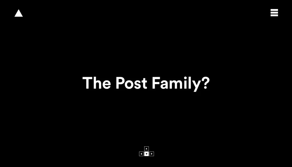
With the basics offered, we can move forward to how incorporating minimalist web features can help your business stand out. The minimalist design focuses on compelling designs. To quote Matt D’Avella, “Minimalism has become a trendy lifestyle for millennials and Gen Z, but it’s not just about having less stuff. It’s about creating space for what truly matters.”
Minimalism Web Design – Distinguished Content
A compelling argument that stands forth with minimalist web design is its idea of having the content really stand out and shine! Placing your content center stage shifts the light onto what truly matters. For many artists, photographers and even writers, using a minimalist web design is usually their go-to.
Minimalism Web Design – UI/UX Intentions
We always hear the saying, ‘Don’t judge a book by its cover’ and the same applies for minimalist web design. Though it appears to be easy on the surface, as opposed to the more complex designs associated with maximalism, minimalism web designs are actually harder.
Let’s break it down. Minimalism Web Design is blasted for all to see. Every choice that UI/UX designers choose to take is on full display for every visitor who lands on the website.
Minimalism Web Design – Negative Space
An important element of a good minimalist design is the use of negative space. Take it this way, ‘minimalist design is just as much about what isn’t there as what is’. White space, which is also referring to negative space, is the empty area around the content and/or design. Regardless of the actual emptiness, negative space might be filled with a background texture, pattern, or color.
The idea remains, the space is not used, in the same way as other existing elements. White space can also help cultivate interesting shapes or images within a design that may not be as obvious at first glance.
Minimalism Web Design – Photography, Typography, and Contrast
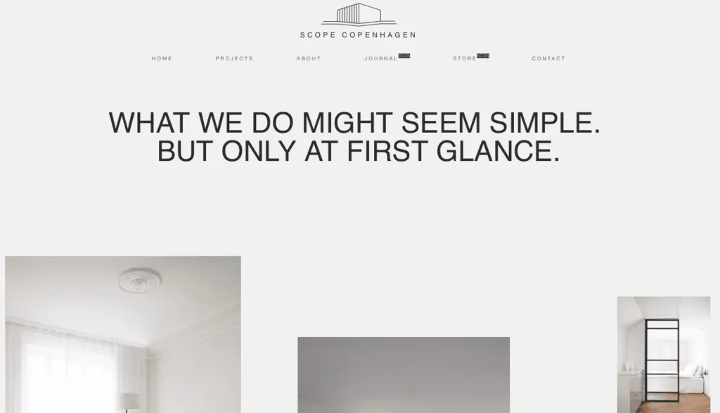
When we say minimal, we never intend to say boring. Drama can still be a viable factor within these designs. Photos chosen should in themselves be minimal, however, the background could add color contrast or a design element that matches and elevates the overall design.
Minimalist Web Design – Visual Hierarchy
Everything within a minimalist design has a purpose and is deliberate. Nothing is unintentional as opposed to maximalist designs. With errors going unnoticed, it is very hard to dismiss it on a minimalist website. When discussing visual hierarchy, it’s of the essence to arrange design elements in a way that establishes clear order of importance and guides.
Key considerations for creating effective visual hierarchy:
- Focus on essential elements and remove unnecessary clutter
- Contrasting colors, sizes, shapes and fonts draw visitors attention
- Place a focal point in the center of the page, however, if you don’t want to center your content, go for larger size fonts or contrast to have your design stand out.
- Use bold, italics styles to emphasize important words or phrases.
- Use a grid system or create clear visual hierarchy through the use of white space and/or other design elements.
Importance of Navigation Bar
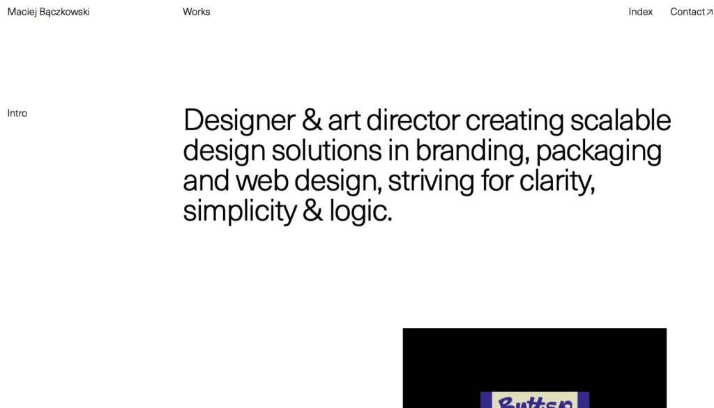
A minimal web design offers user-friendly navigation. A very popular type of navigation design patterns are known as hamburger and kebab menus. Hamburger menus consist of three or four horizontal lines, while the kebab menus consist of three dots. Users are mostly after an easily accessible website that steers clear of competing elements.
Minimalist Color Palettes
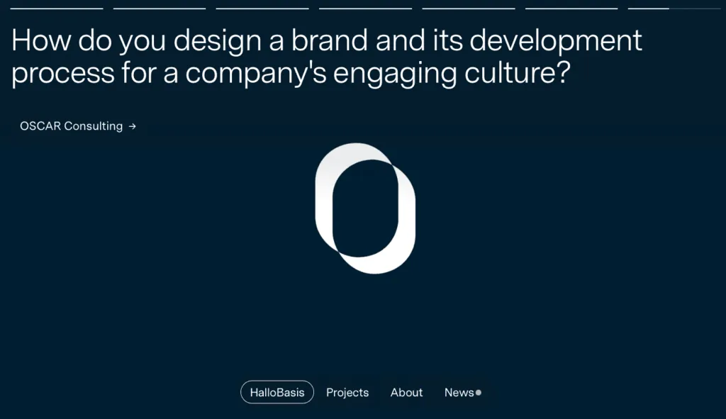
Plenty of minimalist sites only use two colors, however, others prefer to restrict themselves to three, four or more. Keep in mind that the use of a color palette will not break your minimalist web design. Food for thought: every choice needs to remain intentional and improve overall user experience.
Minimalism Web
Using a website builder to create a landing page with minimalist web design can help to convey a clear and concise message while providing a visually pleasing user experience. Showcase, inspire, and begin to apply your business vision to life by using a style that fluffs your brand. If you happen to enjoy other web designs and want to know more about the trends taking off in 2023, we nudge you to read our blog, 10 Best Website Design Trends of 2023.
TAGS:
Join the GuruDesk community and be among the first ones to discover the hottest trends in web services! We are a team of web experts and we love sharing our knowledge and experience with our readers! We share tips and tricks on a wide range of topics, including web development, cloud services, and hosting. Whether you are a seasoned pro or just starting out, we promise you will find valuable information here. So go ahead, hit that “Subscribe” button and let the fun begin!


